I am going to use my last post to quickly do a run down of the semester for Communication Graphics.
Coming in to this class I had some kind of idea of what kind of work I would be doing and what would be expected from me. Being on the computer and working with the different programs and seeing what we can and can not do on photo shop and In design.
Overall I liked the class and recommend to any communication major. They don't necessarily need to be a graphic design major or anything of that sort but I think this class gives you an introduction on hands on work on designing and how to use the programs.
The first project we did is the one that I am most proud of. It was fun brainstorming ideas and then bringing them to life. It was a challenge to use shape, line, pattern, space, value and color. I was very happy about it and I believe my class mates were impressed with it as well. The next project that I did that I am also proud of is my brochure. I like being able to open peoples eyes to my culture and what not. I feel like the east coast does not get much of diverse when it comes to things like that. Of course you see tattoos left and right but those are tattoos you see every day. The Samoan tattoos have traditions and meaning.
One thing I would recommend that the class could use is maybe have a quiz on functions or shot cuts so people would not be asking the same questions over and over again. I know sometimes it happens and I found myself asking the same question but after messing around with shortcuts that I know I was able to figure it out.
Overall the class is fun and interesting. Even as the weather was becoming nice outside I still found myself coming to class because I really liked learning things in photo shop and in design. That can take part because of the professor on making the environment fun to come to every Tuesday and Thursday nights!
Thank you Amy!
Friday, May 17, 2013

Thursday, May 16, 2013
Hollywoods Studio Logo.
So I am going to compare and contrast five of the most popular producers in Hollywood. 20th Century Fox, Paramount, Columbia and Metro Goldwyn Mayer (more recognizable by its acronyms) MGM.
Lets start off with 20th Century Fox Television. This studios most popular films include Star Wars, X-Men, Die Hard and Alien. TV- shows produced by the studio include The Simpson's, Family Guy, Glee and 24 to name some. Since the birth of 20th Century Fox in 1935 it's logo has not made any drastic changes. I could not find the reason why they chose this logo. But I do know is that the company will not be changing its logo because the current logo is one of the most recognizable in the world and has "real value" and "positive association" to the public, particularly over seas says an Exec from the company. He also says "it's an 80 year old brand that stand for something and means something to people" so the company will not be changing its logo any time soon.
The logo is pretty basic with box letters that seem to go further back than the height. Kind of gives the feeling that its coming towards you. With the spot lights on the side high lighting the name gives it some character too. I also like the contrast of the sky and clouds with its different colors.
Next we will talk about Paramount. The logo was established in 1914 by W.W. Jodkinson. Apparently he walked by a building complex hearing the name paramount and doodled a star crested mountain and that logo became Paramount's trademark. I'm not sure how accurate this story is but that is one of the few answers i was able to find. Anyways for paramount, a big snowy mountain surrounded by 23 stars... it seems simple and looks majestic. With the mountain being so big it towers over the clouds and also with the contrast of the background sky and clouds works well too.
Next is Columbia Studio which is pretty much a life like statue of the Statue of Liberty in NYC. Also with the clouds in the background. I think its an image every American can relate to because the statue is so iconic which kinda makes Columbia logo iconic as well. In all three of these graphic designs have clouds and the sky. There most of been created by the same person?
Last but not least is MGM. Using the black back ground helps make the gold pop out of the screen. Also using a lion makes it stand out more. I also like how the film roll actually forms a design around the lion as well.
If each of these were shown to me, I would probably be able to name Paramount, Columbia and 20th Century Fox. MGM name does not really pop out. With the lion roaring it takes away from you actually reading the logo.
To answer the questions about the cloud, yes the same person did design Paramount, Columbia and 20th century fox. Another fun fact is that the lion in MGM killed his trainer a few days after filming for MGM and the lion was put down soon after.
Lets start off with 20th Century Fox Television. This studios most popular films include Star Wars, X-Men, Die Hard and Alien. TV- shows produced by the studio include The Simpson's, Family Guy, Glee and 24 to name some. Since the birth of 20th Century Fox in 1935 it's logo has not made any drastic changes. I could not find the reason why they chose this logo. But I do know is that the company will not be changing its logo because the current logo is one of the most recognizable in the world and has "real value" and "positive association" to the public, particularly over seas says an Exec from the company. He also says "it's an 80 year old brand that stand for something and means something to people" so the company will not be changing its logo any time soon.
The logo is pretty basic with box letters that seem to go further back than the height. Kind of gives the feeling that its coming towards you. With the spot lights on the side high lighting the name gives it some character too. I also like the contrast of the sky and clouds with its different colors.
Next we will talk about Paramount. The logo was established in 1914 by W.W. Jodkinson. Apparently he walked by a building complex hearing the name paramount and doodled a star crested mountain and that logo became Paramount's trademark. I'm not sure how accurate this story is but that is one of the few answers i was able to find. Anyways for paramount, a big snowy mountain surrounded by 23 stars... it seems simple and looks majestic. With the mountain being so big it towers over the clouds and also with the contrast of the background sky and clouds works well too.
Next is Columbia Studio which is pretty much a life like statue of the Statue of Liberty in NYC. Also with the clouds in the background. I think its an image every American can relate to because the statue is so iconic which kinda makes Columbia logo iconic as well. In all three of these graphic designs have clouds and the sky. There most of been created by the same person?
Last but not least is MGM. Using the black back ground helps make the gold pop out of the screen. Also using a lion makes it stand out more. I also like how the film roll actually forms a design around the lion as well.
If each of these were shown to me, I would probably be able to name Paramount, Columbia and 20th Century Fox. MGM name does not really pop out. With the lion roaring it takes away from you actually reading the logo.
To answer the questions about the cloud, yes the same person did design Paramount, Columbia and 20th century fox. Another fun fact is that the lion in MGM killed his trainer a few days after filming for MGM and the lion was put down soon after.
Massimo Vignelli
Massimo Vignelli was born Jan. 1931 in Milan, Italy. He has work in many areas packaging design, furniture design and graphic designer. In his early life, Vignelli studied architecture at Politecnico di Milano and later the Universita di Architect, Venice. In 1996 Vignelli started the New York branch of a new company, Unimark International which eventually became the largest design firm in the world. One of the most recognizable work that Massimo worked on was for American Airlines.
Unfortunately American Airlines just changed the logo which personally I do not find attractive at all. But since there is a merger between them and United airlines I suppose the change was inevitable. The American Airline logo that was created by Vignelli def. is an iconic symbol for the airline.
Massimo also designed the iconic signage for the New York City Subway system.

In 1971 Massimo resigned from Unimark and started his own business with his wife who now reside in NYC. Their company is called Bignelli Associates. Some other well known company that Massimo has made designs for was IBM, Knoll, Bloomingdale's and American Airlines.
Massimo also has accumulated numerous awards. His first award was in 1964 and he was presented the Gran Premio Triennale Di Milano. Since then he has accumulated 22 awards, one being the AIGA gold medal and his most recent in 2005 Architecture award from the American Academy of arts and letters in New York.
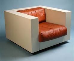
Below are some of Vignelli furniture designs. As you can tell they are very modern and sleek. The furniture brand is called Knoll which is one of the furniture design company he worked for through out his furniture design career.

Here is a little fun fact, Massimo and his wife agreed to donate the entire archive of their design work in 2008 to the Rochester Institute of Technology in Rochester NY. The archive is being exhibited in a new building that was designed by both Lella and Massimo Vignelli. The building is now known as The Vignelli Center for Design and Studies.
Massimo also was apart of a documentary that we actually watched in class which was Helvetica and another documentary called typeface for the same name.
Vignelli stated that the building will house comprehensive archive of graphic design, furniture and objects.
Massimo Vignelli has said "If you can design one thing, you can design everything"
Unfortunately American Airlines just changed the logo which personally I do not find attractive at all. But since there is a merger between them and United airlines I suppose the change was inevitable. The American Airline logo that was created by Vignelli def. is an iconic symbol for the airline.
Massimo also designed the iconic signage for the New York City Subway system.
In 1971 Massimo resigned from Unimark and started his own business with his wife who now reside in NYC. Their company is called Bignelli Associates. Some other well known company that Massimo has made designs for was IBM, Knoll, Bloomingdale's and American Airlines.
Massimo also has accumulated numerous awards. His first award was in 1964 and he was presented the Gran Premio Triennale Di Milano. Since then he has accumulated 22 awards, one being the AIGA gold medal and his most recent in 2005 Architecture award from the American Academy of arts and letters in New York.
Below are some of Vignelli furniture designs. As you can tell they are very modern and sleek. The furniture brand is called Knoll which is one of the furniture design company he worked for through out his furniture design career.
Here is a little fun fact, Massimo and his wife agreed to donate the entire archive of their design work in 2008 to the Rochester Institute of Technology in Rochester NY. The archive is being exhibited in a new building that was designed by both Lella and Massimo Vignelli. The building is now known as The Vignelli Center for Design and Studies.
Massimo also was apart of a documentary that we actually watched in class which was Helvetica and another documentary called typeface for the same name.
Vignelli stated that the building will house comprehensive archive of graphic design, furniture and objects.
Massimo Vignelli has said "If you can design one thing, you can design everything"
Retail logos
One thing that I never paid attention to till this class was the logos that major retailers have. Even though I work for Target I never really sat down and thought about Targets logo or even Walmart's logo. So now I will take time to discuss my thoughts about each retailers logo starting off with my company, Target.

Above is the logo for Target. The design is simple and eye popping with the color red that it uses against the white back ground. The target symbol is now very recognizable and some can say it is iconic. You can associate the symbol as a "Target" or "Bulls eye". They also took it a step further and actually got a mascot with the logo on his eye. I believe they call the dog "bullseye" Of course the breed of the dog, a bull terrier. I believe that the Target logo is a good logo which has made a memorable impression. I am sure if you take the word "Target" and just leave the logo, I am sure that a good majority of people could easily associate the logo with Target.
This next logo is the 2nd biggest retailer in the US for the year 2012. Target is listed 3rd. I personally have never heard of Kroger's and was surprised that they were 2nd on the list above Target. Just off the logo alone I would not know what kind of store Kroger is. Luckily I googled them and they were able to tell me that they are similar to Target and Walmart. For the design it is simple and inviting using the medium to dark color blue and the grayish white on the name. The red does a good job on making the logo pop. Even though Kroger has double the stores of Target I still believe Target logo is more recognizable.

Last but not least the mogul Walmart. Walmart also has a simple design. With its name in a nice blue color and the yellow sun helps the name stand out to grab your attention. This design relies heavily on Walmarts name to designate the sun as part of the logo. I did a test with my roommates and gf and asked them to tell me what the retailer is when I cover up the name and just leave the image. Most of them knew what the Target symbol is and not many knew what the Walmart symbol was.
So all in all Target wins the logo contest.
Above is the logo for Target. The design is simple and eye popping with the color red that it uses against the white back ground. The target symbol is now very recognizable and some can say it is iconic. You can associate the symbol as a "Target" or "Bulls eye". They also took it a step further and actually got a mascot with the logo on his eye. I believe they call the dog "bullseye" Of course the breed of the dog, a bull terrier. I believe that the Target logo is a good logo which has made a memorable impression. I am sure if you take the word "Target" and just leave the logo, I am sure that a good majority of people could easily associate the logo with Target.
This next logo is the 2nd biggest retailer in the US for the year 2012. Target is listed 3rd. I personally have never heard of Kroger's and was surprised that they were 2nd on the list above Target. Just off the logo alone I would not know what kind of store Kroger is. Luckily I googled them and they were able to tell me that they are similar to Target and Walmart. For the design it is simple and inviting using the medium to dark color blue and the grayish white on the name. The red does a good job on making the logo pop. Even though Kroger has double the stores of Target I still believe Target logo is more recognizable.
Last but not least the mogul Walmart. Walmart also has a simple design. With its name in a nice blue color and the yellow sun helps the name stand out to grab your attention. This design relies heavily on Walmarts name to designate the sun as part of the logo. I did a test with my roommates and gf and asked them to tell me what the retailer is when I cover up the name and just leave the image. Most of them knew what the Target symbol is and not many knew what the Walmart symbol was.
So all in all Target wins the logo contest.
Ice cream designs
In another class of mine, Communication Research we were asked to get into groups and pick a semester topic. Our semester topic that my group picked was Abbott's Frozen Custard. We were asked to do several projects through out the semester. One of the task that we had to do was to conduct a focus group. During our focus group we asked the participants to pick out logos of Ice cream parlors that they like and what about them attracts them to that design.
One of the question was to see which Abbott's logo was more appealing to customers. Below are the choices the participants had to choose from.
A)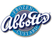 B)
B)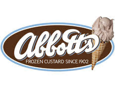
C)
D)
Most of the participants chose B. After asking why they choose B All of them said that they had no idea what Abbott's frozen Custard is and having an actual image of the ice cream cone helps them know what the product is. Option B is actually the current logo for Abbott's Frozen Custard. The other reason why is that people are not very familiar with what frozen custard is too.
Another fun fact about the logo is that you can not find the font anywhere else. The logo is actually the signature of the individual who first started the company. Abbott's Frozen Custard is based out of Rochester NY and is actually looking to branch out further into the state and throughout the United States.
What I really like about option B is that the colors are nice and warm and inviting. The actual name is nice and neat even though it is in cursive. The picture of the ice cream cone gives a visual of what the product is and draws the attention of people.

Above is a Anderson's logo as well. As you can see they are very similar in design. With the name of the company and a cone. Personally Abbott's design is better from everything with the ice cream cone and how the letters are designed.
One of the question was to see which Abbott's logo was more appealing to customers. Below are the choices the participants had to choose from.
A)
C)
D)
Most of the participants chose B. After asking why they choose B All of them said that they had no idea what Abbott's frozen Custard is and having an actual image of the ice cream cone helps them know what the product is. Option B is actually the current logo for Abbott's Frozen Custard. The other reason why is that people are not very familiar with what frozen custard is too.
Another fun fact about the logo is that you can not find the font anywhere else. The logo is actually the signature of the individual who first started the company. Abbott's Frozen Custard is based out of Rochester NY and is actually looking to branch out further into the state and throughout the United States.
What I really like about option B is that the colors are nice and warm and inviting. The actual name is nice and neat even though it is in cursive. The picture of the ice cream cone gives a visual of what the product is and draws the attention of people.
Above is a Anderson's logo as well. As you can see they are very similar in design. With the name of the company and a cone. Personally Abbott's design is better from everything with the ice cream cone and how the letters are designed.
Wednesday, May 15, 2013
Exercise 5: Amelia Earhart
This exercise was actually quite fun and wish as a class we could of spent more time on this exercise. I have actually downloaded several photo shop applications and tried to learn on my own but there is just way to much to learn and I really did not have the patient to sit and learn everything through books and websites!
The exercise was fairly simple to follow both through Amy's instructions and by reading the instructions through the book. First we had to crop the girls head out of the picture, which I feel bad about! Then we had to crop out a piece of the flag and replace the ladies head. Once we got that, we had to use the clone tool to blend the part of the flag with the rest. This tool was actually pretty cool and fun to use. Grabbing bits of pieces through out the flag and placing them with the new one. I think I did a pretty fare job if I say so myself.
The next thing we had to do was to open a picture of Amelia Earhart and crop her head and place it in the original picture with the other women. Once Earhart head was placed in the picture we had to turn the picture black and white. Once the picture was made into black and white I had to use the burn tool to make Earhart's black and white picture blend in with the original black and white picture.
Like I said earlier in the post, I wish we spent more time using photo shop in this way, imposing images onto others. Maybe we could make some pictures have subliminal messages or images in the picture.
Recommendation for next semester maybe use photo shop and attempt to create your own subliminal message within the image. I think that would be a fun project. For critiques you can have each student hold their poster up and have class mates guess at the message and the person with the board can give clues.
Just a suggestion... take it or leave?! :-)
The exercise was fairly simple to follow both through Amy's instructions and by reading the instructions through the book. First we had to crop the girls head out of the picture, which I feel bad about! Then we had to crop out a piece of the flag and replace the ladies head. Once we got that, we had to use the clone tool to blend the part of the flag with the rest. This tool was actually pretty cool and fun to use. Grabbing bits of pieces through out the flag and placing them with the new one. I think I did a pretty fare job if I say so myself.
The next thing we had to do was to open a picture of Amelia Earhart and crop her head and place it in the original picture with the other women. Once Earhart head was placed in the picture we had to turn the picture black and white. Once the picture was made into black and white I had to use the burn tool to make Earhart's black and white picture blend in with the original black and white picture.
Like I said earlier in the post, I wish we spent more time using photo shop in this way, imposing images onto others. Maybe we could make some pictures have subliminal messages or images in the picture.
Recommendation for next semester maybe use photo shop and attempt to create your own subliminal message within the image. I think that would be a fun project. For critiques you can have each student hold their poster up and have class mates guess at the message and the person with the board can give clues.
Just a suggestion... take it or leave?! :-)
Travers Collins
A few years ago I was asked to be apart of a focus group for Travers Collins which is located on Exchange street down town Buffalo. My roommate who actually works for the company asked me to help them pick a design for billboards for the advertisement for the Buffalo Police Department entry exam. When I arrived to Travers Collins I was introduce to the product manager and other individuals that have been working on the project. I was offered some refreshments, Pizza and wings and soda, yummy!!

I was sat in a room with four or five other individuals that were there to help with the selection. We were shown six different ideas they came up with. All six ideas were presented to us and I really did not know what to think about it at first. I remember some were really busy and others were really simple. I remember one were it was busy were they had the lights and people in the back ground and a yellow caution tape in the front, but instead of the yellow tape reading caution it said something about signing up for the Buffalo Police exam which was coming up shortly. There was another similar one like that but without the busy back ground and just the yellow tape. A couple of the posters played with words, such as the Miranda rights. I believed it said "You have the right to make a difference... take the Buffalo exam" something along those lines. I actually didn't know it was playing on words with the Miranda rights "You have the right to remain silent..." till one of the project managers brought it to our attention.

They also asked us what we thought about the images, how it was presented, if the message was getting across, if the poster would grab my attention. They also asked about faces, names and what not being present on the poster.
I believe they choose only two of the posters that were presented to me to be placed on billboards around Buffalo. One was with two officers faces and a badge telling them to sign up and that they can make a difference and the other one was with blue back ground and the yellow caution tape saying to sign up for the exam.
Now that I think about it, some of the designs that my class mates came up with for our posters were as good if not better then some of the designs that were shown to me that day.
I was sat in a room with four or five other individuals that were there to help with the selection. We were shown six different ideas they came up with. All six ideas were presented to us and I really did not know what to think about it at first. I remember some were really busy and others were really simple. I remember one were it was busy were they had the lights and people in the back ground and a yellow caution tape in the front, but instead of the yellow tape reading caution it said something about signing up for the Buffalo Police exam which was coming up shortly. There was another similar one like that but without the busy back ground and just the yellow tape. A couple of the posters played with words, such as the Miranda rights. I believed it said "You have the right to make a difference... take the Buffalo exam" something along those lines. I actually didn't know it was playing on words with the Miranda rights "You have the right to remain silent..." till one of the project managers brought it to our attention.
They also asked us what we thought about the images, how it was presented, if the message was getting across, if the poster would grab my attention. They also asked about faces, names and what not being present on the poster.
I believe they choose only two of the posters that were presented to me to be placed on billboards around Buffalo. One was with two officers faces and a badge telling them to sign up and that they can make a difference and the other one was with blue back ground and the yellow caution tape saying to sign up for the exam.
Now that I think about it, some of the designs that my class mates came up with for our posters were as good if not better then some of the designs that were shown to me that day.
Subscribe to:
Posts (Atom)