Friday, May 17, 2013

Comic Sans

So I did Comic Sans because I know you (Amy) absolutely have comic sans. So I decided to dig in a little deeper and see the origins and the creator of Comic Sans.

Vincent Connare 2012.jpg

Comic Sans was created by the guy above, Vincent Connare. Connare is an American font designer where he studied at New York Institute of Technology and then his masters degree in type design at the University of Reading. Connare is responsible for Comic Sans and the Trechuchet MS font which you can find on Microsoft Windows and Mac OS as a pre-installed type font.

Comic Sans was released in 1994 by the Microsoft Corporation. Comic Sans is classified as a casual, non-connecting script, and was designed to intimate the historical look of the comic book lettering for the use in informal documents. Since Comic Sans is available through Microsoft windows 95, the font has become widely used and is now being criticized for it.


After reading several websites and why people are so against using Comic Sans is because it is widely used and used incorrectly. I mean what do you expect if it is a free font when you purchase a Microsoft computer or lap top. It is a type face that does not look to serious and fun to use. Similar to Helvetica on being widely used and in appropriate use of the type face. If you think about it, there are no written rules for the average person to read and refer to when it comes to what font is used for what situation.

Paul Rand

Paul Rand is an American graphic designer who is best known for his corporate logo designs. Some of the companies that he made logos for are IBM, UPS, Enron, NeXT and ABC. Rand went to Pratt Institute, Art Students league and Parsons The New School of Design.

Rand was born in 1914 in Brooklyn, NY. Rand had an early start on design with painting signs for his fathers grocery store as well as for school events. You can say Rand is a self-taught as a designer. Rand first assignments was a part time position creating stock images.

Some of his designs for corporations are still in use. Companies such as IBM, ABC, UPS and Enron still use Rands graphic design.


Above are some of the company's logos he has design. Rands design are very simple but pleasant to look at. The one I like the most is the first image of IBM with using the artistic eye, bee and using the original M. It is very clever and easy to recognize. Even something as simple as that is very eye pleasing. The next one I like is UPS. It is very simple but uses a shield like a family crest like knights used back in the mid evil days.

This is a quote from Louis Danziger:

"He almost single handedly convinced business that design was an effective tool. [. . .] Anyone designing in the 1950s and 1960s owed much to Rand, who largely made it possible for us to work. He more than anyone else made the profession reputable. We went from being commercial artists to being graphic designers largely on his merits"

Rand taught design at Yale University and is inducted into the New York Art Directors Club Half of Fame in 1972.

Rand devoted his last years designing and writing his memoirs. Rand died at the age 82 from cancer in 1996.

John Henry Alvin

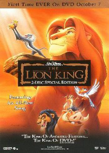
John Alvin was born November 24, 1948 in Massachusetts. Alvin and his family finally settled in California after his dad retired from the military. Alvin was an American cinematic artist and painter. Alvin is recognizable by his movie posters. Some of his movie posters include ET, Aladdin, Beauty and the Beast, Little Mermaid and The Lion King to name a few.


Alvins first movie poster he ever did was in 1974 for a movie called Blazing Saddles, directed by Mel Brooks. Alvins work for Blazzing Saddles was liked by Books and many other in the industry. Alvin went on to work on a number of Book's later film. Alvin has created artwork for more than 135 film campaigns over 36 years or three decades. One of his most recent works was for the Trilogy of Lord of the Rings and Harry Potter.

Alvins most iconic poster is probably ET.


The design shows E.T's finger touching the finger of his human friend, Elliot, finger tip to finger tip. The fingers create a glow where they touch. The idea for the poster was suggest by the director, Spielberg, and was inspired by Michelangelo's painting, The creation of Adam. Supposedly Alvin used his own daughter Farah Alvin, as the human hand model for the poster.

Alvin also created several masterpieces in Disney Fine Art, which are highly collected and considered extremely valuable. Alvin passed away Feb. 6, 2008.

Comm graphics

I am going to use my last post to quickly do a run down of the semester for Communication Graphics.

Coming in to this class I had some kind of idea of what kind of work I would be doing and what would be expected from me. Being on the computer and working with the different programs and seeing what we can and can not do on photo shop and In design.

Overall I liked the class and recommend to any communication major. They don't necessarily need to be a graphic design major or anything of that sort but I think this class gives you an introduction on hands on work on designing and how to use the programs.

The first project we did is the one that I am most proud of. It was fun brainstorming ideas and then bringing them to life. It was a challenge to use shape, line, pattern, space, value and color. I was very happy about it and I believe my class mates were impressed with it as well. The next project that I did that I am also proud of is my brochure. I like being able to open peoples eyes to my culture and what not. I feel like the east coast does not get much of diverse when it comes to things like that. Of course you see tattoos left and right but those are tattoos you see every day. The Samoan tattoos have traditions and meaning.

One thing I would recommend that the class could use is maybe have a quiz on functions or shot cuts so people would not be asking the same questions over and over again. I know sometimes it happens and I found myself asking the same question but after messing around with shortcuts that I know I was able to figure it out.

Overall the class is fun and interesting. Even as the weather was becoming nice outside I still found myself coming to class because I really liked learning things in photo shop and in design. That can take part because of the professor on making the environment fun to come to every Tuesday and Thursday nights!

Thank you Amy!

Thursday, May 16, 2013

Hollywoods Studio Logo.

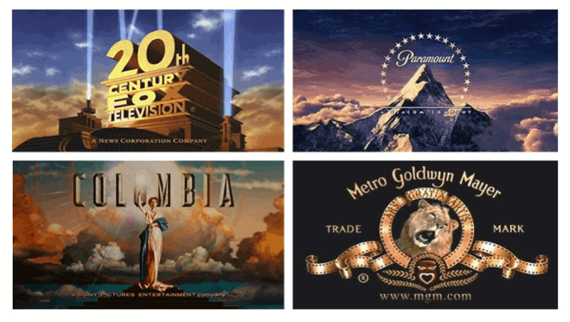
So I am going to compare and contrast five of the most popular producers in Hollywood. 20th Century Fox, Paramount, Columbia and Metro Goldwyn Mayer (more recognizable by its acronyms) MGM.

Lets start off with 20th Century Fox Television. This studios most popular films include Star Wars, X-Men, Die Hard and Alien. TV- shows produced by the studio include The Simpson's, Family Guy, Glee and 24 to name some. Since the birth of 20th Century Fox in 1935 it's logo has not made any drastic changes. I could not find the reason why they chose this logo. But I do know is that the company will not be changing its logo because the current logo is one of the most recognizable in the world and has "real value" and "positive association" to the public, particularly over seas says an Exec from the company. He also says "it's an 80 year old brand that stand for something and means something to people" so the company will not be changing its logo any time soon.

The logo is pretty basic with box letters that seem to go further back than the height. Kind of gives the feeling that its coming towards you. With the spot lights on the side high lighting the name gives it some character too. I also like the contrast of the sky and clouds with its different colors.

Next we will talk about Paramount. The logo was established in 1914 by W.W. Jodkinson. Apparently he walked by a building complex hearing the name paramount and doodled a star crested mountain and that logo became Paramount's trademark. I'm not sure how accurate this story is but that is one of the few answers i was able to find. Anyways for paramount, a big snowy mountain surrounded by 23 stars... it seems simple and looks majestic. With the mountain being so big it towers over the clouds and also with the contrast of the background sky and clouds works well too.

Next is Columbia Studio which is pretty much a life like statue of the Statue of Liberty in NYC. Also with the clouds in the background. I think its an image every American can relate to because the statue is so iconic which kinda makes Columbia logo iconic as well. In all three of these graphic designs have clouds and the sky. There most of been created by the same person?

Last but not least is MGM. Using the black back ground helps make the gold pop out of the screen. Also using a lion makes it stand out more. I also like how the film roll actually forms a design around the lion as well.

If each of these were shown to me, I would probably be able to name Paramount, Columbia and 20th Century Fox. MGM name does not really pop out. With the lion roaring it takes away from you actually reading the logo.

To answer the questions about the cloud, yes the same person did design Paramount, Columbia and 20th century fox. Another fun fact is that the lion in MGM killed his trainer a few days after filming for MGM and the lion was put down soon after.

Massimo Vignelli

Massimo Vignelli was born Jan. 1931 in Milan, Italy. He has work in many areas packaging design, furniture design and graphic designer. In his early life, Vignelli studied architecture at Politecnico di Milano and later the Universita di Architect, Venice. In 1996  Vignelli started the New York branch of a new company, Unimark International which eventually became the largest design firm in the world. One of the most recognizable work that Massimo worked on was for American Airlines.

Unfortunately American Airlines just changed the logo which personally I do not find attractive at all. But since there is a merger between them and United airlines I suppose the change was inevitable. The American Airline logo that was created by Vignelli def. is an iconic symbol for the airline.

Massimo also designed the iconic signage for the New York City Subway system.


In 1971 Massimo resigned from Unimark and started his own business with his wife who now reside in NYC. Their company is called Bignelli Associates. Some other well known company that Massimo has made designs for was IBM, Knoll, Bloomingdale's and American Airlines.

Massimo also has accumulated numerous awards. His first award was in 1964 and he was presented the Gran Premio Triennale Di Milano. Since then he has accumulated 22 awards, one being the AIGA gold medal and his most recent in 2005 Architecture award from the American Academy of arts and letters in New York.

Below are some of Vignelli furniture designs. As you can tell they are very modern and sleek. The furniture brand is called Knoll which is one of the furniture design company he worked for through out his furniture design career.


Here is a little fun fact, Massimo and his wife agreed to donate the entire archive of their design work in 2008 to the Rochester Institute of Technology in Rochester NY. The archive is being exhibited in a new building that was designed by both Lella and Massimo Vignelli. The building is now known as The Vignelli Center for Design and Studies.

Massimo also was apart of a documentary that we actually watched in class which was Helvetica and another documentary called typeface for the same name.

Vignelli stated that the building will house comprehensive archive of graphic design, furniture and objects.

Massimo Vignelli has said "If you can design one thing, you can design everything"

Retail logos

One thing that I never paid attention to till this class was the logos that major retailers have. Even though I work for Target I never really sat down and thought about Targets logo or even Walmart's logo. So now I will take time to discuss my thoughts about each retailers logo starting off with my company, Target.


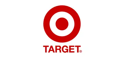
Above is the logo for Target. The design is simple and eye popping with the color red that it uses against the white back ground. The target symbol is now very recognizable and some can say it is iconic. You can associate the symbol as a "Target" or "Bulls eye". They also took it a step further and actually got a mascot with the logo on his eye. I believe they call the dog "bullseye" Of course the breed of the dog, a bull terrier. I believe that the Target logo is a good logo which has made a memorable impression. I am sure if you take the word "Target" and just leave the logo, I am sure that a good majority of people could easily associate the logo with Target.


This next logo is the 2nd biggest retailer in the US for the year 2012. Target is listed 3rd. I personally have never heard of Kroger's and was surprised that they were 2nd on the list above Target. Just off the logo alone I would not know what kind of store Kroger is. Luckily I googled them and they were able to tell me that they are similar to Target and Walmart. For the design it is simple and inviting using the medium to dark color blue and the grayish white on the name. The red does a good job on making the logo pop. Even though Kroger has double the stores of Target I still believe Target logo is more recognizable.


Last but not least the mogul Walmart. Walmart also has a simple design. With its name in a nice blue color and the yellow sun helps the name stand out to grab your attention. This design relies heavily on Walmarts name to designate the sun as part of the logo. I did a test with my roommates and gf and asked them to tell me what the retailer is when I cover up the name and just leave the image. Most of them knew what the Target symbol is and not many knew what the Walmart symbol was.

So all in all Target wins the logo contest.

Ice cream designs

In another class of mine, Communication Research we were asked to get into groups and pick a semester topic. Our semester topic that my group picked was Abbott's Frozen Custard. We were asked to do several projects through out the semester. One of the task that we had to do was to conduct a focus group. During our focus group we asked the participants to pick out logos of Ice cream parlors that they like and what about them attracts them to that design.

One of the question was to see which Abbott's logo was more appealing to customers. Below are the choices the participants had to choose from.

A)B)
C)
D)

Most of the participants chose B. After asking why they choose B All of them said that they had no idea what Abbott's frozen Custard is and having an actual image of the ice cream cone helps them know what the product is. Option B is actually the current logo for Abbott's Frozen Custard. The other reason why is that people are not very familiar with what frozen custard is too.

Another fun fact about the logo is that you can not find the font anywhere else. The logo is actually the signature of the individual who first started the company. Abbott's Frozen Custard is based out of Rochester NY and is actually looking to branch out further into the state and throughout the United States.

What I really like about option B is that the colors are nice and warm and inviting. The actual name is nice and neat even though it is in cursive. The picture of the ice cream cone gives a visual of what the product is and draws the attention of people.


Above is a Anderson's logo as well. As you can see they are very similar in design. With the name of the company and a cone. Personally Abbott's design is better from everything with the ice cream cone and how the letters are designed.

Wednesday, May 15, 2013

Exercise 5: Amelia Earhart

This exercise was actually quite fun and wish as a class we could of spent more time on this exercise. I have actually downloaded several photo shop applications and tried to learn on my own but there is just way to much to learn and I really did not have the patient to sit and learn everything through books and websites!

The exercise was fairly simple to follow both through Amy's instructions and by reading the instructions through the book. First we had to crop the girls head out of the picture, which I feel bad about! Then we had to crop out a piece of the flag and replace the ladies head. Once we got that, we had to use the clone tool to blend the part of the flag with the rest. This tool was actually pretty cool and fun to use. Grabbing bits of pieces through out the flag and placing them with the new one. I think I did a pretty fare job if I say so myself.

The next thing we had to do was to open a picture of Amelia Earhart and crop her head and place it in the original picture with the other women. Once Earhart head was placed in the picture we had to turn the picture black and white. Once the picture was made into black and white I had to use the burn tool to make Earhart's black and white picture blend in with the original black and white picture.

Like I said earlier in the post, I wish we spent more time using photo shop in this way, imposing images onto others. Maybe we could make some pictures have subliminal messages or images in the picture.

Recommendation for next semester maybe use photo shop and attempt to create your own subliminal message within the image. I think that would be a fun project. For critiques you can have each student hold their poster up and have class mates guess at the message and the person with the board can give clues.

Just a suggestion... take it or leave?! :-)

Travers Collins

A few years ago I was asked to be apart of a focus group for Travers Collins which is located on Exchange street down town Buffalo. My roommate who actually works for the company asked me to help them pick a design for billboards for the advertisement for the Buffalo Police Department entry exam. When I arrived to Travers Collins I was introduce to the product manager and other individuals that have been working on the project. I was offered some refreshments, Pizza and wings and soda, yummy!!


I was sat in a room with four or five other individuals that were there to help with the selection. We were shown six different ideas they came up with. All six ideas were presented to us and I really did not know what to think about it at first. I remember some were really busy and others were really simple. I remember one were it was busy were they had the lights and people in the back ground and a yellow caution tape in the front, but instead of the yellow tape reading caution it said something about signing up for the Buffalo Police exam which was coming up shortly. There was another similar one like that but without the busy back ground and just the yellow tape. A couple of the posters played with words, such as the Miranda rights. I believed it said "You have the right to make a difference... take the Buffalo exam" something along those lines. I actually didn't know it was playing on words with the Miranda rights "You have the right to remain silent..." till one of the project managers brought it to our attention.


They also asked us what we thought about the images, how it was presented, if the message was getting across, if the poster would grab my attention. They also asked about faces, names and what not being present on the poster.

I believe they choose only two of the posters that were presented to me to be placed on billboards around Buffalo. One was with two officers faces and a badge telling them to sign up and that they can make a difference and the other one was with blue back ground and the yellow caution tape saying to sign up for the exam.

Now that I think about it, some of the designs that my class mates came up with for our posters were as good if not better then some of the designs that were shown to me that day.

Milton Glaser

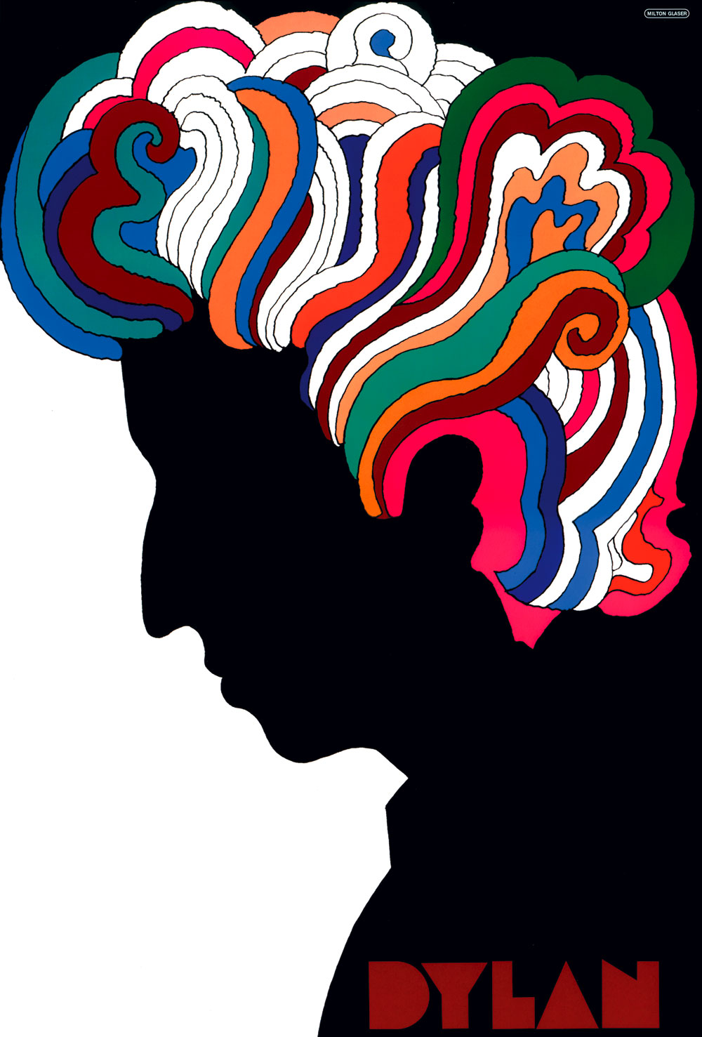
If you were to ask me "Who is Milton Glaser" in the beginning of this semester I would say "I have no clue". If you were to show me four different pictures of Milton Glaser and ask me to pick one out I would say the same thing. Even though I have seen his work plenty of times, I would not know who he is. To be honest with you the "I love NY" seems so simple that I thought some hobo off the streets of NYC came up with and it just caught on with everyone! Even with his Dylan poster I never knew that Glaser was the one that was responsible for that and I consider myself a big Bob Dylan fan!


One thing that I find really fascinating with Glaser is that when he was approached to fix NY and make an iconic poster he was not given tons of money. (From what I understand from the documentary that we watched on him in class) I could of heard wrong? In the short film we were able to see inside his building and how he works. It amazes me that after all the work he has done and I'm assuming all the money he has made from his work that he is still in the same building working closely with others not thinking he is some hot shot!

Another thing that I like about Glaser is his little sign that says who is in the building.

It is very sleek and looks like a sky scraper with the letters representing windows!


Now every time I see one of Milton Glaser work and I am with friends I also act like I know everything about graphic designs asking them if they know who designed that poster and what other famous posters he has came up with!


My favorite would obviously be the Bob Dylan poster. With the black as the background for the face and the his hair being so colorful!! And the block letters he used for Dylan as well works very well as a whole! Like I said earlier with the "I love NY" design, it looks so simple that a drifter in the streets of NY came up with. The idea is not complicated and it seems like something that a elementary kid would come up with. Maybe that's why it is so catchy and popular!!

Project 4: Critiquing

I was really impressed with every ones projects. Even though none of us are professional graphic designers or get paid for the work we do, I definitely think that the posters were professionally done. I think everyone bought a different aspect of what we have learned so far through out the class. The ideas that were made I could tell reflected some of my classmates personality's.

During our critiques as a class, I am very surprised to hear so many of my class mates speak up and give their opinions whether it be good or bad or just saying that they like it. Some of the opinions I do agree with and very few that I don't agree with. It is going to be very interesting to see what people say about my brochure since it has to do with tattoos and what not.

Like I said in my earlier post about my project that I was not very pleased with it. I had a chance to ask a couple of my class mates what they thought and they said they liked it a lot. I'm not sure if they were being honest or being nice, but whatever reason it was it made me feel better about my poster. While I was up there I didn't get much criticism which could be a good or bad thing. I will take it as a positive thing!!

All in all I think the class as a whole did an outstanding job on their posters. I am sure if they had a little more time and a little more experience there design can be seen by their peers and the whole world.

I am actually pretty excited to see what my class mates have for our final project. I want to see how everyone used what we learned all year to incorporate into our brochure. Every time we go into a critique I expect to see some above average projects but there has always been two or three that really grabbed my attention and say wow, good job. I may not say it verbally but I am thinking it and I hope I am able to see some cool designs for the brochures.

Tuesday, May 14, 2013

Saul Bass

Saul Bass is arguably one of the most famous graphic designer in US history. Even though he might not be a house hold name such as movie stars or famous athletes, but Bass has left his mark in history. We see his work day in and day out, whether it is riding the bus, buying groceries or waiting in the airport. Bass was many of things in his lifetime, a graphic designer, title designer and a film director.

In Bass early life, he graduated from James Monroe high school in the Bronx and studied part time at the Art Students League in Manhattan. Bass began in his time in Hollywood in the early 1940's doing print work for film ads.

Throughout Bass film industry he has worked on many movies. Bass first movie he had done some kind of part is in 1954 film Cameron Jones to his last in 1995 with Casino. In total of 49 different films. Probably his most famous is Vertigo and Psycho. Bass worked with some of the biggest filmmakers like Alfred Hitchcock, Billy Wilder, Stanley Kubrick and Martin Scorsese. And besides the posters, which would be the first thing that you would think of as a graphic designer’s job, he was also in charge of the title sequence and the credits and he for each project he was able to create something extraordinary with these most simple means like I said earlier.

Saul Bass is an American graphic designer and a academy award winning filmmaker. Bass was born May 8, 1920 in New York City and passed April 25, 1996 in Los Angeles. During his 40 year career Bass has worked on many Hollywood movies and title. Not only did he work in the film industry and making titles and poster but he also had his hand dipped in major markets in the retail industry. He has worked on many logos through out the US. Just to name some a few, General Foods, United airways Quaker oats and Dixie.


Bass has also showed us how versatile graphic designer can be.


News Gothic

News Gothic is probably most famous for appearing in the opening and closing credits of Star Wars!! I actually stumbled upon this when I was googling what to write about.

News Gothic is a realist sans serif typeface designed by Morris Fuller Benton and released by American type founders (ATF) in 1908.


There are a few distinctive characteristics of News Gothic that stick outs from other type  face. There are the two story lowercase a and the g. Also unique are the blunt terminus at the apex of the lowercase t and the location of the tail of the uppercase Q completely outside the bowl.

NGsp4.svg


Some of the places that you do see News Gothic or other versions of News Gothic is the Brooklyn Academy of Music which was designed by Michael Beirut. The font is also found on Otil Elevator push buttons which was manufactured from the 1920s through the 1960's. News Gothic is also used in Nature Magazine, art work by Lady Gaga which is called "The Fame Monster". who would of thought Lady Gaga would use a font named News Gothic! And of course the most famous that News Gothic was used is the opening credits for Star Wars!!

There is a enhanced version of News Gothic which is called News Gothic No. 2. This face type differs from News Gothic by adds more weights. Some other variants from News goth is Benton Sans which is an expanded font family from the Font Bureau. Linotype Gothic, which was based on Heidelber Gothic is a variant with italic type glyphs. A Cyrillic version was developed for Para Type in 2005 by Kmitry Kirsanov, based on Bitstream's version of News Gothic.

So overall News Gothic was some what popular when it first came out. It has had some stints in major retail company such as JC Penny advertisements and popular pop artist such as Lady Gaga using it in her art work. Movies and elevators also got on board with using this font.

Other then the information I was able to find on Wikipedia I was not able to find much more information.

Logos

I believe I wrote about this in the first blog about logos. below will be a serious of logos and we are going to see if people can spot what subliminal message or images they have in hidden in the logo!!

Good luck!!


The fedex logo was created in 1994 by Linden Leader and associates. If you look closely at the orange letters "E" and "x" there is a arrow pointing to the right. The arrow is suppose to signify precision and speed, some say it represent forward, moving forward. Whatever it means Linden and Leader and associates were very clever on creating the arrow with the two letters!!


Is there a number you see in Baskin Robbins logo? If not go back and look for a 3 and 1. Once you realize that there is a number in the logo it is pretty simple to pick it out. The number is 31, which represents the 31 different flavors they have.


This one might be a little more obvious. In the word Tour the R is tweaked into a man hunched over a yellow blob. See it now? Good job! I also think this was a clever design too. Even though most people know what Tour of France.


This one might be the hardest to see!! If you know anything from Toblerone chocolate, Toblerone is the name of the town that came up with the chocolate. And if you know anything else about Toblerone it is located in the mountains and the mountains are known for their bears... do you see it yet? Well if you look closely at the mountain at the white space you can see a dancing bear... pretty neat right? If not... I think so!


Last but not least is this logo. If you are not a baseball fan then you will not know this logo. The logo above is the Milwaukee Bucks. At first glance you may see a glove and a baseball but if you look a little closer you will see the initials of the ball club. The lower case b is the thumb and palm of the glove and the lower case m is the ringers!!


So the next time you are out and about make sure you spend that extra second or two looking at logo to see if you can find a subliminal image!!

Sunday, May 12, 2013

Project 4

Project four was to design a tri-fold brochure. Coming into this project I had a few ideas how I wanted to design the brochure. I already had a solid topic that I wanted to do which evolves around Samoan tribal tattoos. The biggest obstacle with this project was finding pictures that are big enough to fit on the brochure. Most of the pictures that I saved on my flash drive at home were no were near the correct size that I needed. So I tweaked my search and searched for images on google images for images that were 4 MP or larger. That alone narrowed down my selection and none of the pictures that I originally sought to use were not on the list that were shown. After sifting through countless pictures I was able to find four to six solid images that I could use for the project.

The next hardest thing for me was the cover page. After several designs I was not able to come up with an appealing front page that would grab peoples attention. Finally after several trial and errors and some help from Amy, I was able to settle with an image that covered the whole front page. The image is of a individual sitting on the front of a small boat with his traditional lava lava looking out into the ocean. The person has his shirt off so you are able to see his traditional tattoo. The small title in white letters saying "Traditional Samoan Tattoo" on the back ground of the blue sky and then "The Pe'a" which is on the bottom of the page with white lettering on a black background which is the shadow underneath a compartment on the boat.

The brochure gives a quick back ground of what the "Pe'a" tattoo is. The Pe'a tattoo was a way to symbolize that you were no longer a boy and that you were now a man amongst the tribe. It was a right of passage into manhood. The tattoo would cover the lower torso for the men ranging from the hip to the back to the knees. This process was done in pairs and never by its self. The tattoo traditionally takes 10 days. 5 days of tattooing and 5 days of rest. During the 5 days of tattooing women would be chanting a song in the back ground while the elder was tattooing the person the old fashion way with sharp bone on an end of a stick and repeatedly hitting the stick into the skin. On the days that the boy wasn't being tattooed he would bathe in the ocean to heal up his wounds.

Overall I am very happy how the brochure turned out. I believe the pictures are nice and sharp and should grab everyone attention with the amount of tattooing that is done on the individual.

Project 3

Project three was pretty hectic. I started pretty late on the assignment so off the back time was against me. My original idea for this project was to do something that evolves around being fit, working out or something along those lines. But as I started to work on this theme for a class and a half I ran into a huge problem!! All my ideas were already taken from Nike and Gatorade ads. So I had to scratch that idea.

My next idea was going to be about Dooms day preppers. The poster was going to be set up with black background, and in bold letters say Dooms day preppers. Below that would say "Don't come running to me when the shit hits the fan" The phrase would be in bold letters that were stretched and made more bold. The reason I wanted it to be more bold was that the phrase and title would have a picture of a nuclear explosion going off in the type face. As you were reading "Dooms Day Preppers. Don't come running to me when the shit hits the fan" you were able to see the image on a larger scale. But that idea was shot down by Amy so I had one more class and the weekend to come up with a good idea.

I eventually settled on a topic that I have been following real close which involves North Korea and the United Nations. So for this I started with a black background and kind of used the idea of 1+1=2. So I started off with some kind of symbolic picture of North Korea, whether it be the flag or the face of Kim Jong-Un then I would have the plus symbol and some kind of picture of a nuclear device or the nuclear symbol. I ended up with a picture of a mobile long range missile launcher. After that I had the equal sign of a skull. At the bottom of the poster in white lettering it said "Stop North Korea from obtaining Nukes"

The message I was trying to get across was that if we do not put strict regulation against North Korea, they could possibly start another world war. It is a topic that I follow because my dad is in the military and also because I think most people do not take this topic very serious.


North Korea + Nuclear missiles = Death/Destruction