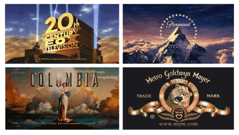
Lets start off with 20th Century Fox Television. This studios most popular films include Star Wars, X-Men, Die Hard and Alien. TV- shows produced by the studio include The Simpson's, Family Guy, Glee and 24 to name some. Since the birth of 20th Century Fox in 1935 it's logo has not made any drastic changes. I could not find the reason why they chose this logo. But I do know is that the company will not be changing its logo because the current logo is one of the most recognizable in the world and has "real value" and "positive association" to the public, particularly over seas says an Exec from the company. He also says "it's an 80 year old brand that stand for something and means something to people" so the company will not be changing its logo any time soon.
The logo is pretty basic with box letters that seem to go further back than the height. Kind of gives the feeling that its coming towards you. With the spot lights on the side high lighting the name gives it some character too. I also like the contrast of the sky and clouds with its different colors.
Next we will talk about Paramount. The logo was established in 1914 by W.W. Jodkinson. Apparently he walked by a building complex hearing the name paramount and doodled a star crested mountain and that logo became Paramount's trademark. I'm not sure how accurate this story is but that is one of the few answers i was able to find. Anyways for paramount, a big snowy mountain surrounded by 23 stars... it seems simple and looks majestic. With the mountain being so big it towers over the clouds and also with the contrast of the background sky and clouds works well too.
Next is Columbia Studio which is pretty much a life like statue of the Statue of Liberty in NYC. Also with the clouds in the background. I think its an image every American can relate to because the statue is so iconic which kinda makes Columbia logo iconic as well. In all three of these graphic designs have clouds and the sky. There most of been created by the same person?
Last but not least is MGM. Using the black back ground helps make the gold pop out of the screen. Also using a lion makes it stand out more. I also like how the film roll actually forms a design around the lion as well.
If each of these were shown to me, I would probably be able to name Paramount, Columbia and 20th Century Fox. MGM name does not really pop out. With the lion roaring it takes away from you actually reading the logo.
To answer the questions about the cloud, yes the same person did design Paramount, Columbia and 20th century fox. Another fun fact is that the lion in MGM killed his trainer a few days after filming for MGM and the lion was put down soon after.
No comments:
Post a Comment